


PROJECT:
Green Citrus
The client, Green Citrus, was looking for a revamp to their branding to better communicate their product to potential customers. Their product is an app that helps users discover new and exciting recipes, and branch out from their tried and true cooking methods so that they can learn and grow in their cooking journey.
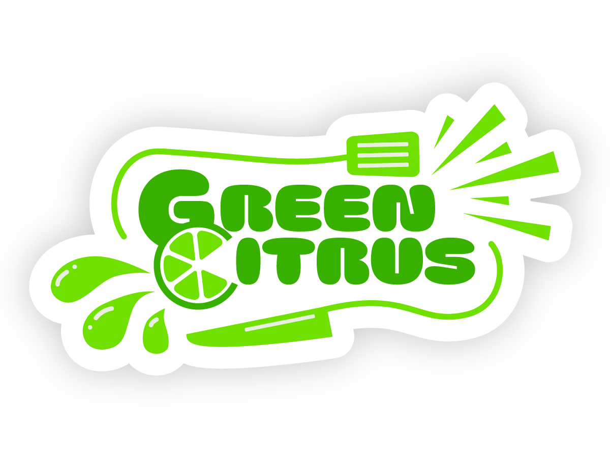
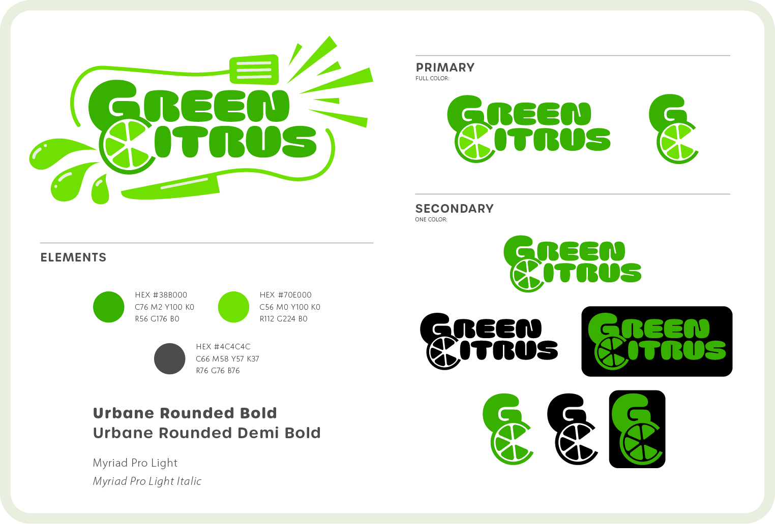
To accomplish this, the brand design leans heavily into the excitement of discovery, utilizing two bright greens as the main brand colors. The flairs framing the logo suggest the variety and excitement that the product has to offer.
The logo was created to have three main forms: the full logo with flairs, full logo with no flairs, and a logomark.
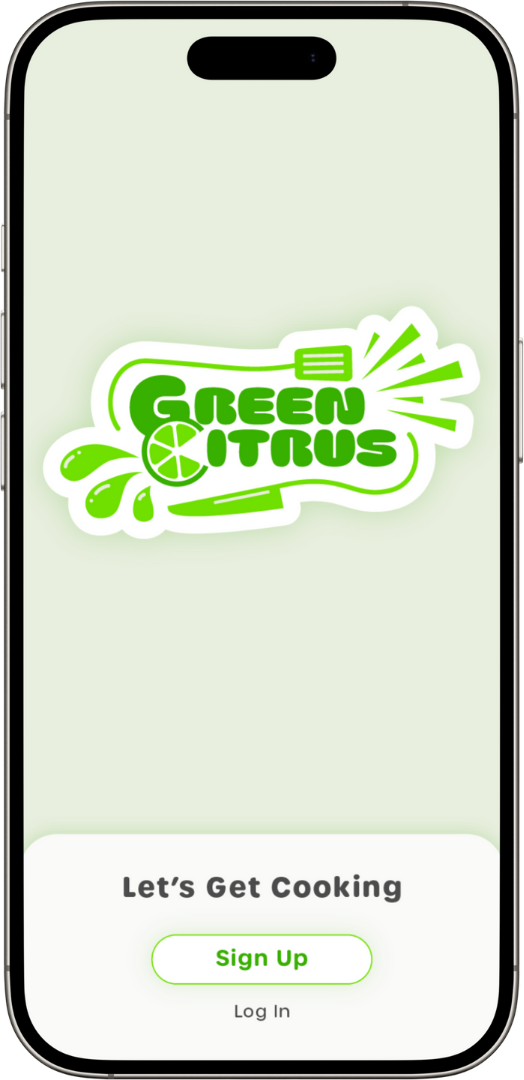
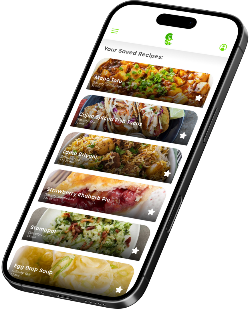
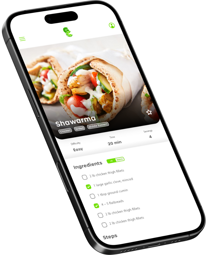
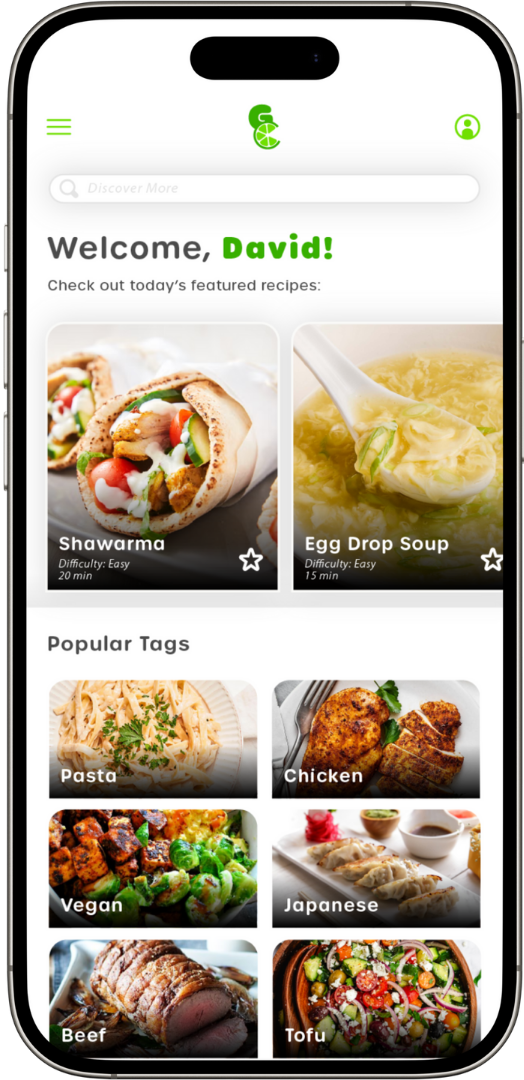
The client also requested suggestions for the UI design for the product, to ensure that the user has a cohesive brand experience. The mockups presented to the client showcase a sleek, vibrant user interface that highlights the ease of discovery on Green Citrus.
The work featured on this page is a conceptual project. Any potential similarities to existing companies are unintentional and coincidental.